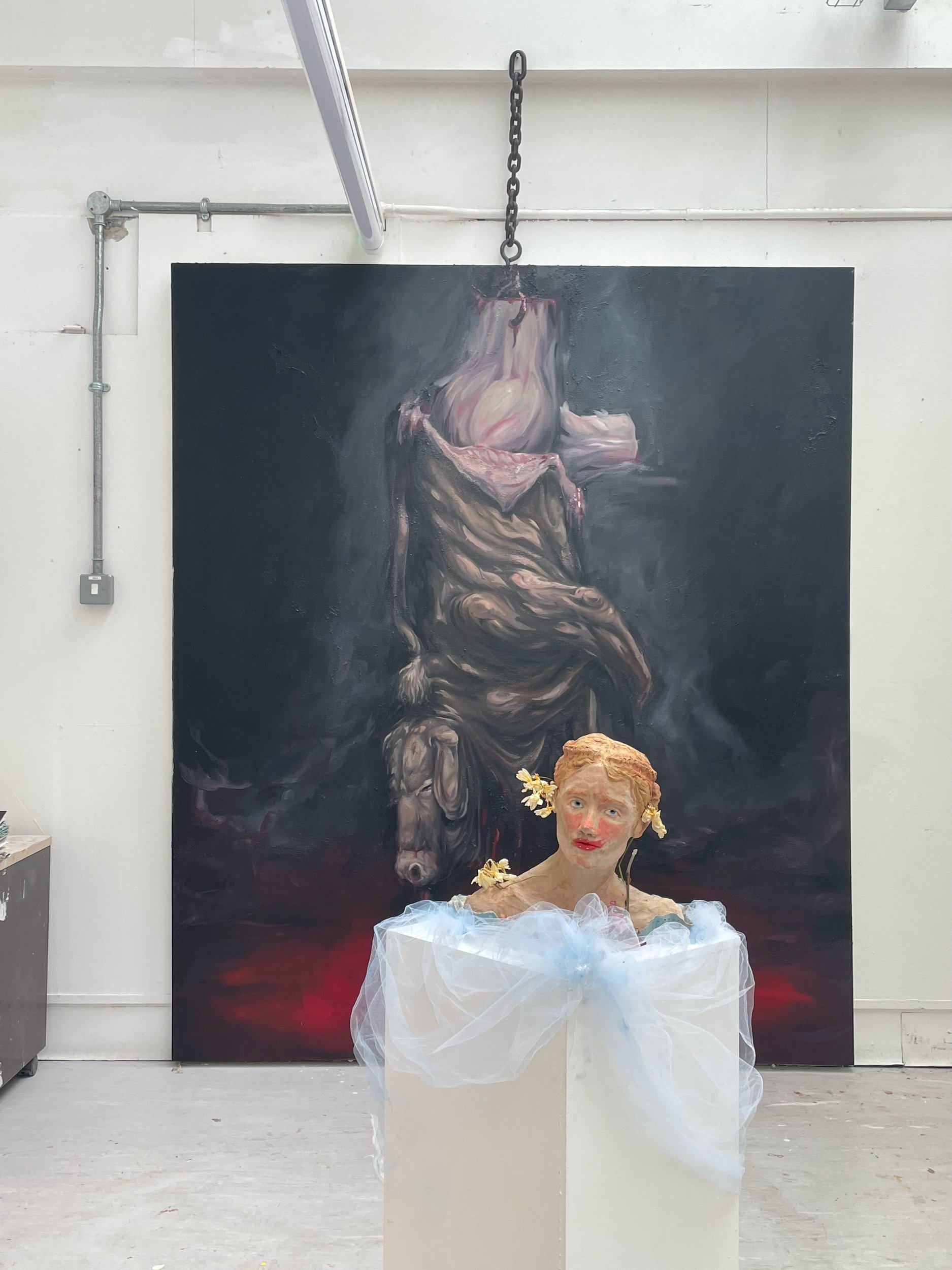
Wk25.
Lo.
Lola.
Lolita.
For my final display of work I had decided a few weeks prior not to overwhelm myself with too much work and chose to spend my time curating the space to best show off the pieces I was most proud of and in doing so warm up my curatorial senses.
The Two Pieces required for this installation are:
Together the two come together quite nicely but because the studios are a tad on the grimy side I feel I don’t have the opportunity to do the white gallery space vibe I had perhaps envisioned initially so I decided I would need to work the space to fit my needs. I considered hiring lighting for the space but with windows and strip lights directly above there is little point in adding Extra lights so…
I drew up some sketches of possible developments (above) and decided to do some -
Trial and Error
The first major consideration was the location of the presentation. Many people said the cow seemed quite intimidating on it’s own against the wall and appeared almost masculine in it’s appearance. I tried tucking it around the corner of the studio as can be seen on pages 1 and 3 above to try and dampen it down but I felt this was counter intuitive to the paintings original purpose as an attention grabbing piece so that was scratched off pretty quickly.
I then considered Finding ways to present the cow to the viewer instead of imposing it upon them. My initial idea was to incorporate textiles of some kind as I do define my practice as Painting, Ceramics and Textiles. At first it was just extending the Blood at the bottom by pooling some red satin but then as I was encouraged by Alex Roberts to embrace my theatre background I considered all the elaborate options of draping and wondered if there was any way I could make that work - I drafted the following:
although not unsuccessful when it came to actually achieve this affect in person I lacked both the space and materials to do so and I’d rather not hinder my studio mates (or my bank account) on an idea I’m not 100% convinced on. The one element I did find successful however was adding Tulle to Lolita but this required some DIY treatment also as it was looking a little too child bride like (left) So I soaked the fabric in some Blue Acrylic water and rinsed it the following morning before adding ruching (right)
Despite my revelation in Displaying Lolita my painting Low still felt underdressed. I considered doing a floral base instead of the aforementioned red fabric - making paper poppies and have them spilling out behind the painting much like the ceramics poppies on the Tower of London (2014) to mark the fallen victims of the war and having them symbolise the fallen women as portrayed in the media. Although the 2 dozen I had made in preparation appeared affective I didn’t particularly have the time or patience to create several hundred more and risk it just looking tacky at the end if rushed and poorly executed.
In the End I decided not to touch the cow too much. I was adamant when designing the piece that it could work as a standalone piece AS WELL AS the backdrop for lolita and by adding garish flourishes I would risk ruining the interpretations by viewers. In the end the way I decided to combine the two can be seen from the final layout below
by adding a subtly application of paint to the back of Lolita’s plinth I feel I’m getting the best of both worlds with a minimalist pairing of the two and a subtle nod towards the other. It also encourages people to actively explore the space and get up close and personal with the works. No stand behind this line in my galleries!
After spending so long working the space to my vision of it I wanted to make the finishing touches just as perfect which is why I spent my last week creating an installation / exhibition guide


