wk 27 - curation and display methods
What pieces do I include?
How do I display them to best highlight the work and convey my theme?
What information do I display about the works and where? (Balancing too much context against too little)
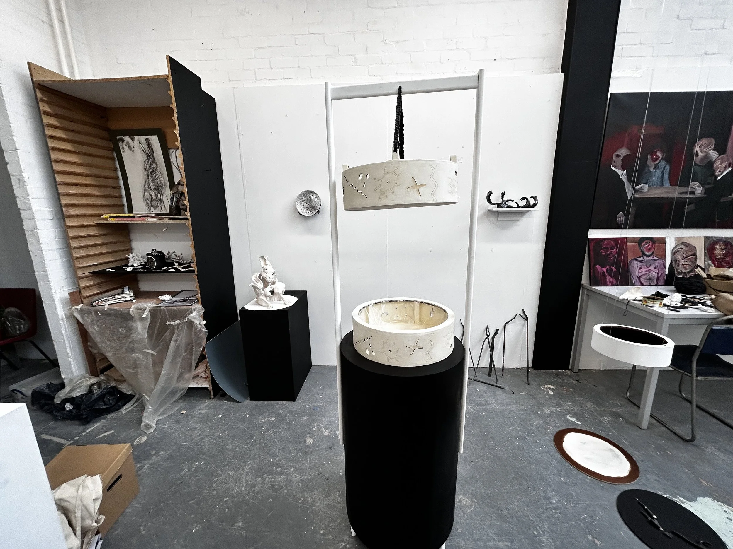
As suggested by Erica Eyres during an open tutorial, I had a very organic approach to curating the space - seeing how things fitted together throughout the semester as new work was being made and then gently adjusting putting equal emphasis on the relationships between the works and the spaces to allow them to breathe. I found most of the works that were chosen to be in the space were either large conceptual pieces (such as the water clock), Work that showed off my skill in the material (such as the hare and the steel antler tips) but also work that exemplified the essence of the project, such as the abstract antler on the shelf, the broken antlers displayed off to the right or the moon which some would consider failed attempts but I found to be extremely valuable to my practice.
As a result many of the works in the final space weren’t put there with the intention of being “final pieces” and many of the works on the shelves to the left aren’t any lesser in value to me but just didn’t fit on this occassion!
Something that helped me make the work feel intentional was to take extreme care to make everything look purposeful yet organic - such as painting walls with an intentional care to highlight the contrasts of black and white as it helped certain works stand out but also led the eye on a journey around the space. The use of levels also plays into this exploration and forces people to get up close to works, look down into them and move around the space physically. The muted colour pallete - almost monochromatic wasn’t intentional but helped create that liminal space in an otherwise very busy studio.
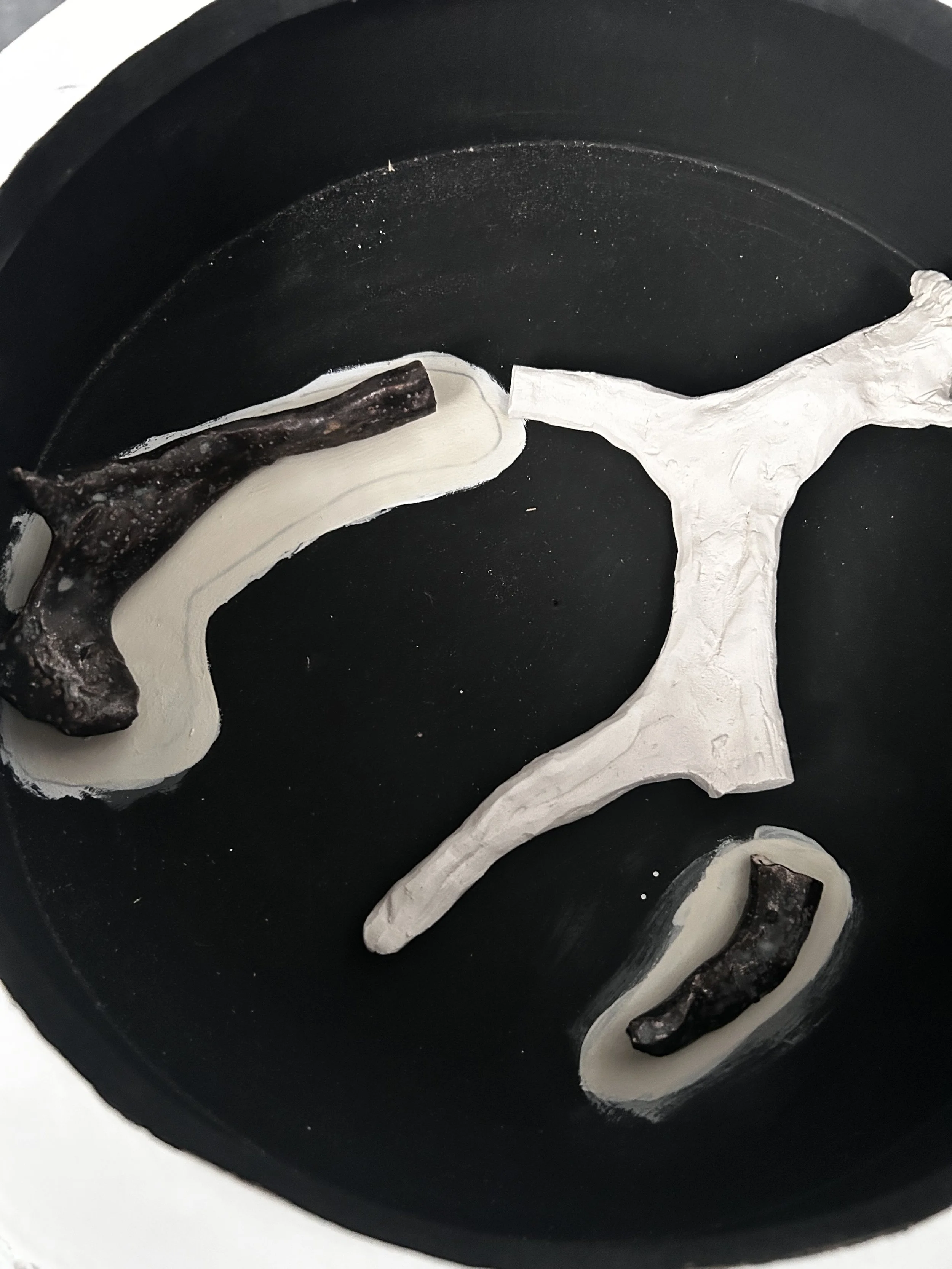
Although I would’ve taken more time to perfect this concept I really enjoyed the idea of these pieces. The wood used to prop them were either test runs or spare wood from the water clock that I used to prevent waste but were in the back of my head all semester as a method of displaying works. Assisted by a passing comment from Mark Wallace about how many pieces appeared archaeological and would be interesting to see displayed in that way, I decided to use salt to create that effect whilst highlighting the bottom work whilst using the bucket above - suspended as you would find in the DCA - but forcing you to look inside to see the work adding a sense of reward to the viewer which they would ideally reflect back into the work.
I think the black to play with depth in the bucket was really vital here but the bronze pigment seemed really garish in the space to the point I hid every other element that included it (see below) but couldn’t find a quick alternative in time that would be more affective than leaving it as it was.
The pure white seemed to garish (and messy if it didn’t have the perfectly clean edge) whilst off white seemed dirty and unintentional
I’m glad I was able to hide the bronze however as it stood out painfully in the monochrome.
Below I discuss some of my inspirational art exhibitions and I have another blog post to discuss my choice to (not) display text in the space. Overall I’m proud of how it all came together and it was undoubtedly helped by my curation experience from side projects this semester and out in Finland. In an ideal world I would have like more breathing space. I tried my best to differentiate my work from others (through the pillar and black presentation) but not being able to get a wide angle shot without capturing someone else’s work so close was frustrating and what makes the difference in other shows between standing out and blending in. I look to previous years degree shows and recall when artist’s have unintentionally shared spaces not considering how their work has influenced (negatively) how they work. So that would be the big change for me in addition to having extra time to tweak presentation which would require time I didn’t have.
Inspirational Exhibitions
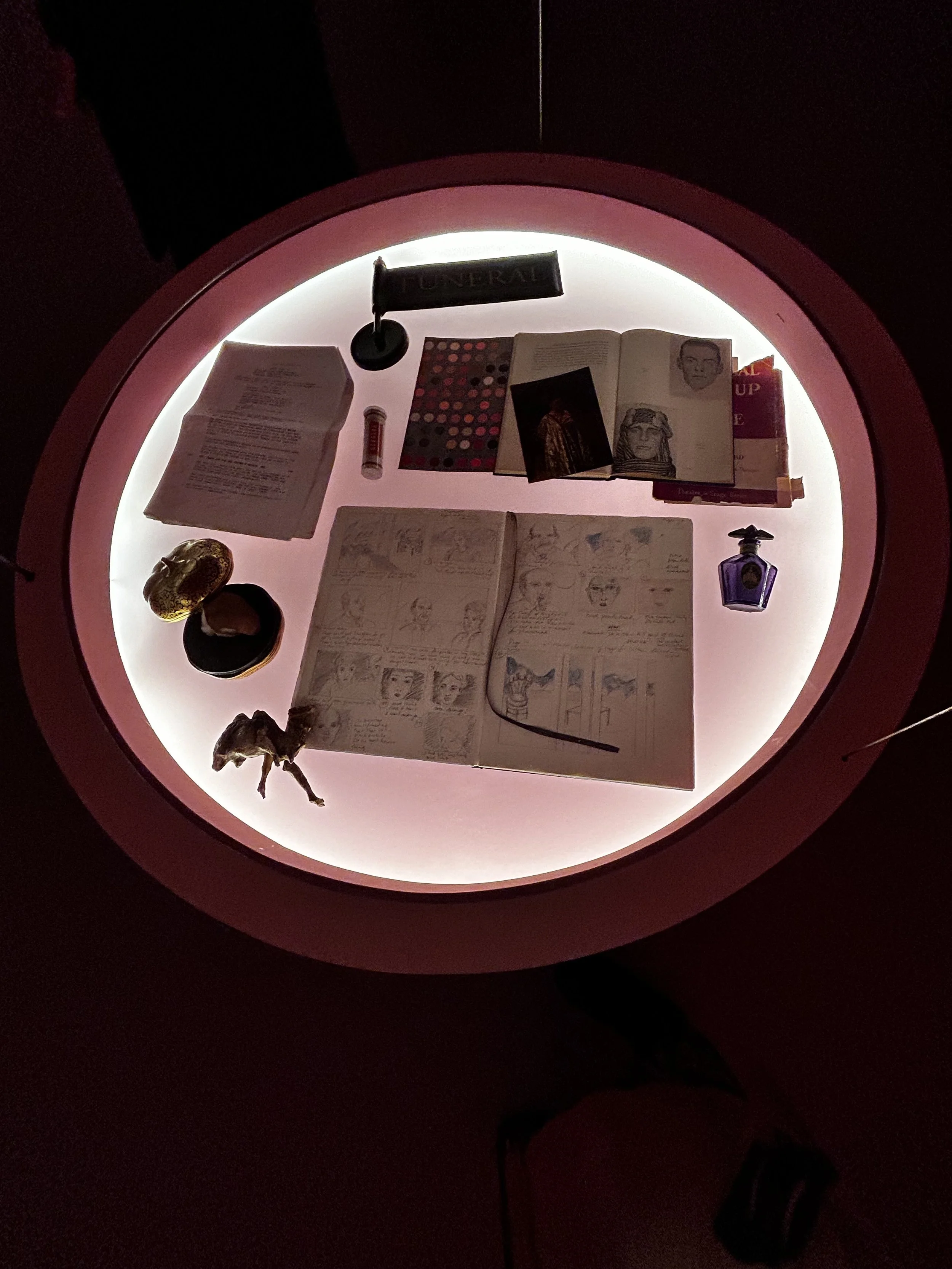
Michelle Williams Gamaker
Our Mountains are Painted on Glass (DCA Jan 2024)
JAAKKO AUTIO
Owla
24 August - 26 November 2023
Oulun Taidemuseo, Oulu Finland
‘What does an internal flood of sensations feel like? Can it be dammed or will it spill over? What kind of space would open up if everything was just allowed to flow?
Owla, meaning flood, is derived from ancient Finnish language and forms the starting point for a new multi-channel sound installation by sound artist Jaakko Autio (b. 1981). The city of Oulu is also named after the flooding of Oulu River that flows through the city.
The flood is a metaphor for the emotional storms and indivisible feelings inside the mind, the moment when tears come out. Images of accumulation, flowing, bursting and surrendering underlie the musical composition. Could it be possible that emotions, when shared, release, strengthen and bind things together?
Helsinki-based sound artist Jaakko Autio explores spaces between people and the human ability to merge into larger wholes. Originally from Yivieska, the artist spent his childhood in Mmbour, Senegal. The influence of the places where he lived as a child is reflected in the way he perceives reality and makes his art.
In sound art, he is interested in the local. Jaakko Autio has a degree in sound design from Uniarts Helsinki. His works have been shown in solo and group exhibitions in Finland and abroad, most recently at the M_Itä? Biennale of Contemporary Art in Joensuu, the Kogo Gallery in Tarto and the Nart Gallery in Narva.
His latest sound work, built into the dark Task space of the museum, was composed in spring 2023 and recorded in Oulu in August 2023. The Oulu-based choirs heard in the work are Cassiopeia, Cantio Laudis and Tuira Chamber Choir.
Sitting on the chairs in the exhibition space is encouraged, and if you change your seat, you can hear different voices. You can also touch the pool of water in the middle of the gallery.
Or just rest and listen.
The sound installation with speech and singing starts when a visitor enters the space and continues with a computer drawing sections at random from eight hours of sound material.’
I loved this work as although it was displayed beautifully it really limited visual stimuli to encourage touch, vibrations of noise, water and space


