Wk 15 - Paris
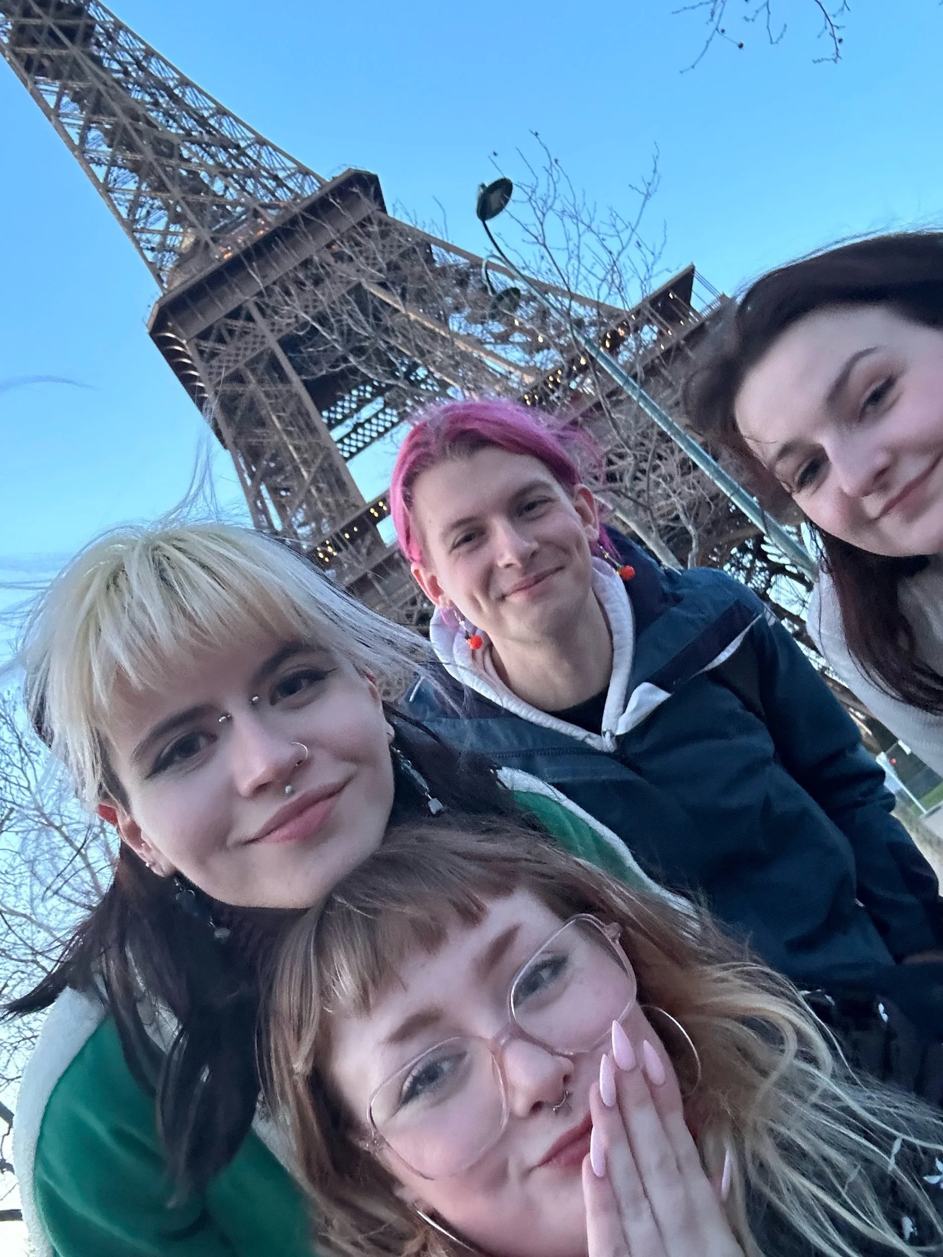
Paris was a blast. Hellish at times but still somehow better than expected #FtF
Takeaways for My Practice
Art and Artist Spotlights
Helene Duprat’s MONSTER SOUP (2023)
I loved duprat’s works in this exhibition. The large expressive paintings and bold statements seemed so much more startling from the female perspective. The Mixed textiles, video elements and interior design with the wall colours and textures really captivated me despite not fully understanding what there exhibition was themed around.
Yves Klein
Easy Klein (2024)
Black and White
Soho Bedroom Bill Brandt (1934) at the Centre Pompidou’s “Corps à Corps” Exhibition

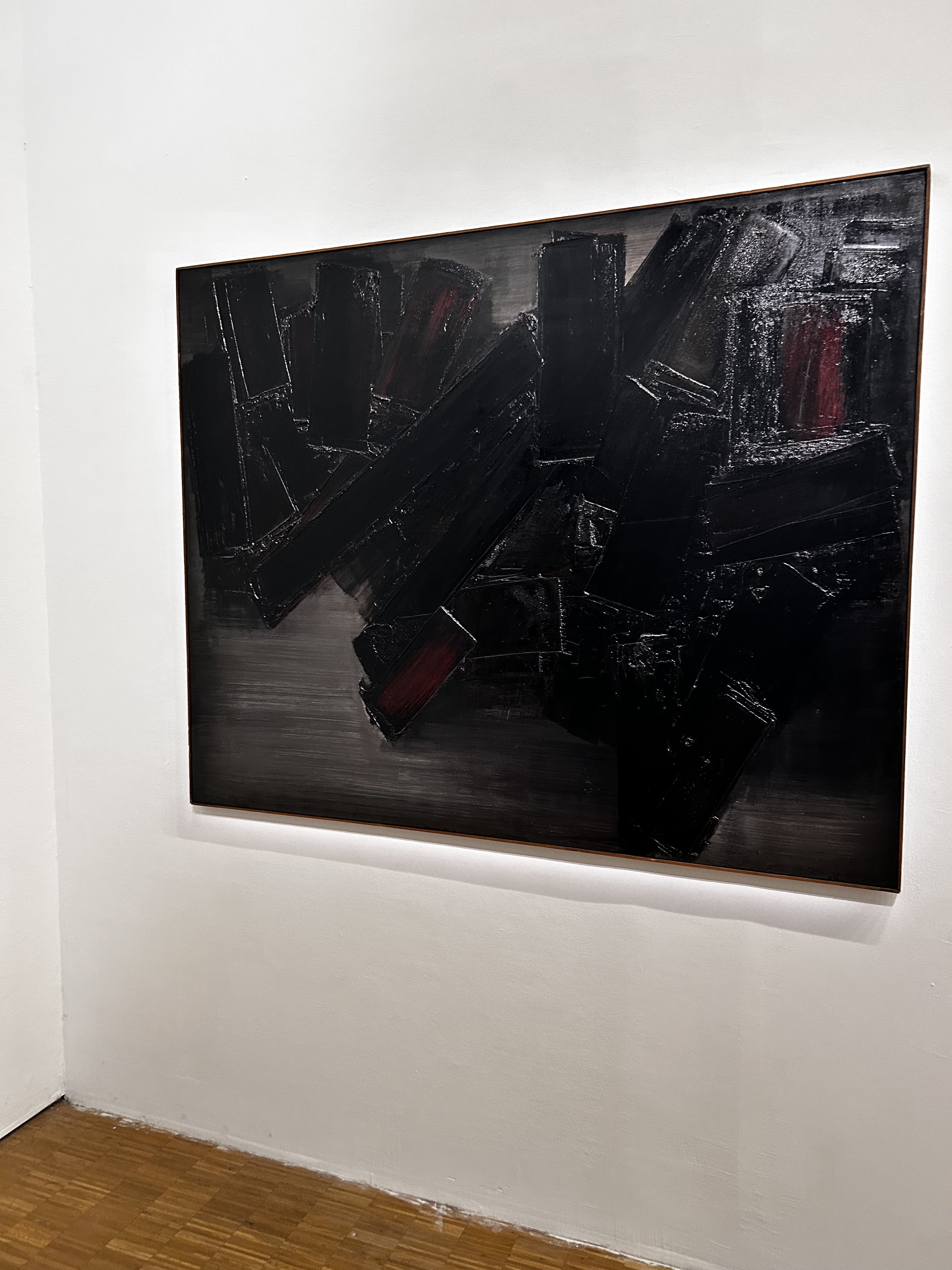


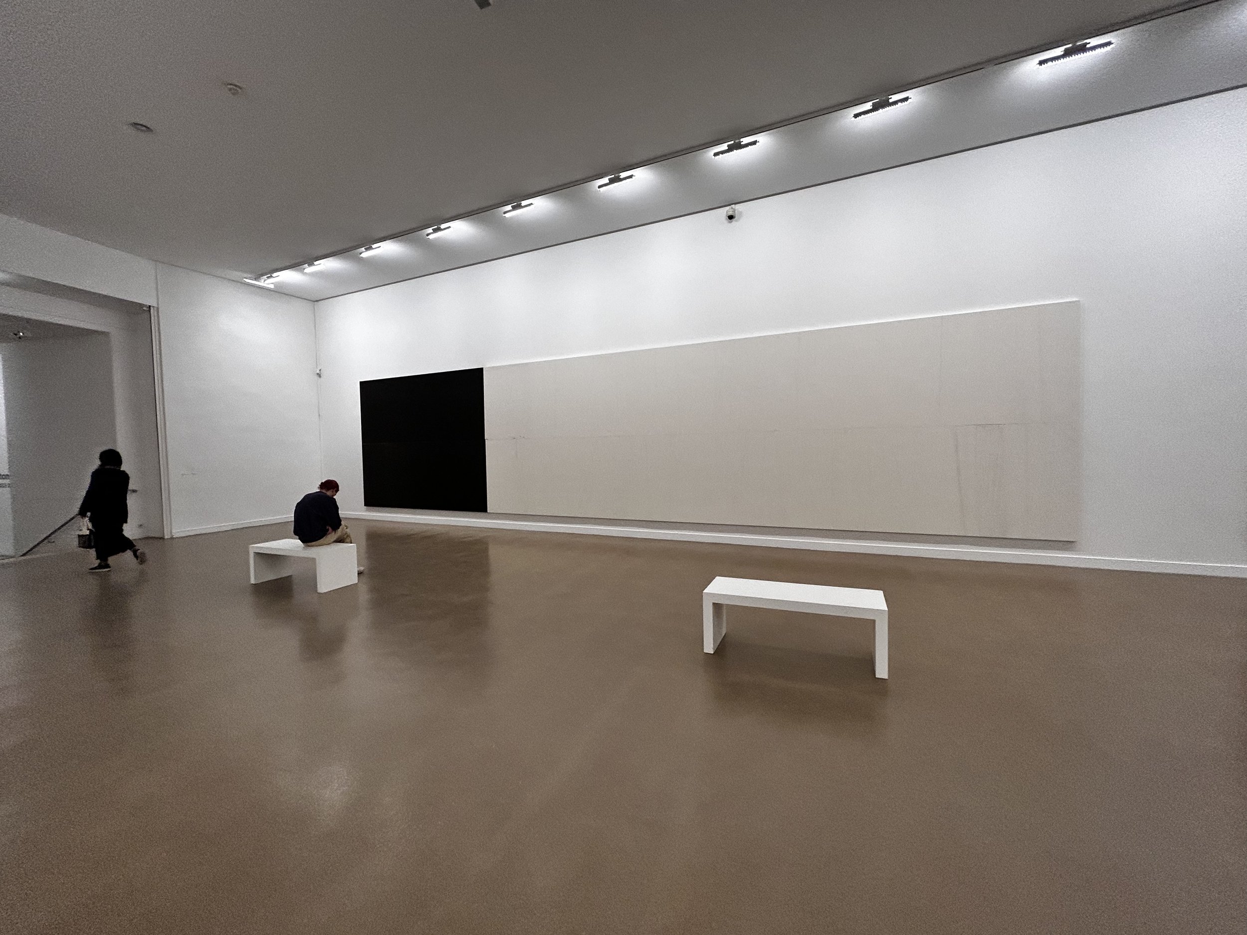
These Large paintings, prints and photo collections have always captivated me. The subtle use of tone exaggerates the texture. I’ve annotated each of the photos with why I appreciate each one and are something I hope to incorporate into future works and experiments.
Thematic and Visual Inspiration
Apart from the catacombs, Paris’ Visual Romantic and grotesque architecture was abundant. For me the Champs-Élysées and surrounding Designer district was eerily accessible with reasonably priced coffee shops next to Luxury High end stores with Locked doors and tight security. Paris in itself seemed a large oxymoron. As above so Below?
Sketchbook Pages
What Next?
Experience, Sketchbooking and Learning
Large experimental and expressive paintings
I’ve recently developed a love for travelling and especially after my semester abroad it feels crucial to my work to experience as much as I can from across the world. Taking my sketchbook work from these experiences in order to incorporate more of my organic, fluid and personal studies into my body of work through painting composition, mediums and sculptures - taking a step back from “Traditional” methodologies of oils and ceramic sculpting
Curation and display Experimentation
The Corps a corps exhibition in Pompidou (2023) took hours of my day as even it’s method of curation piqued my interest. Not only did they use grey tones on the wall, spotlights and black frames for many of the photos but had actually painted a white gradient behind frames and text which not only increased contrast and visibility but created a spotlight effect without the actual glare of light!
The use of hanging elements in this piece Mes voeux (1989) by Annette Messager and the physical searching it encourages you to do
offset placements/scale/contrast
Reference list
Brandt, B. (1934) Soho Bedroom [Photograph] Viewed at “Corps à Corps”. Le Centre Pompidou. 6th September 2023 - 25th March 2024
Centre Pompidou (2023) Corps à Corps [exhibition] Paris. 6th September 2023 - 25th March 2024
Centre Pompidou (2024) James Bishop. Available at https://www.centrepompidou.fr/en/ressources/personne/czAor5b (Accessed: 19th March 2024)
Culture Hustle (2024) Black 4.0. Available at: https://culturehustle.com/collections/black/products/black-4-0 (accessed: 19th March 2024)
Culture Hustle (2024) Easy Klein. Available at: https://culturehustle.com/collections/potions/products/easyklein (accessed: 19th March 2024)
David Zwirner (2014) James Bishop. Available at https://www.davidzwirner.com/exhibitions/2014/james-bishop. (Accessed: 19th September March 2024)
Delprat, H. (2024) Monster Soup [exhibition] Hauser & Wirth, Paris. 20th January – 9th March 2024.


